Blog posts on economic dataPosts selected fromManagement Blog - Engineering Blog - Investing Blog and other blogs - Chart of Net Government Debt from 1980 to 2013 by Country
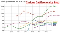 Bloomberg converted the data to look at debt load per person (looking at gross debt – estimated for 2014). Japan has ill-fortune to lead in this statistic with $99,725 in debt per person (242% of GDP), Ireland is in second with $60, 356 (121% of GDP). USA 3rd $58,604 (107%). Singapore 4th $56,980 (106%). Italy 6th $46,757 (133%). UK 9th $38,939 (95%). Greece 12th $38,444 (174%). Germany 14th $35,881 (78%). Malaysia 32nd $6,106 (57%). China 48th $1,489 (21%). India 53rd $946 (68%). Indonesia 54th $919 (27%). continue reading: Chart of Net Government Debt from 1980 to 2013 by Country - How Countries Rank Based on H-index for Science Publications
This data makes a good case for the USA, UK, Germany… producing a very high level of very influential science publications. Whether Italy (#7) is obviously more influential than Brazil (#22) or India (#24) I think is fairly questionable. Also the method has a fairly high lag, I believe, so if a country is gaining influence rapidly the h-index will take longer to have that show up. continue reading: How Countries Rank Based on H-index for Science Publications - We Need to Consider Changing Conditions When Looking at Historical Stock Returns
 Just to over simplify the idea if lets say the market valued the average stock at a PE of 11 and everyone found stocks a wonderful investment. And so more and more people buy stocks and with everyone finding stocks wonderful they keep buying and after awhile the market is valuing the average stock at a PE of 14.
Within the market there is tons of variation those things of course are not nearly that simple, but the idea I think holds. Well if you look back at historical data the returns will include the adjustment of going from a PE of 11 to a PE of 14. Now maybe the new few decades would adjust from PE of 14 to PE of 17 but maybe not. At some point that fundamental re-adjustment will stop. continue reading: We Need to Consider Changing Conditions When Looking at Historical Stock Returns - USA Health Care Spending 2013: $2.9 trillion $9,255 per person and 17.4% of GDP
The slow down in how badly the health care system has performed in the USA has resulted in the share of GDP taken by the health care system finally stabilizing. Health care spending has remained near 17.4% since 2009. While hardly great news, this is much better news than we have had in the last 30 years from the USA health care system. The percentage of GDP taken by the USA health care system is double what other rich countries spend with no better health results. continue reading: USA Health Care Spending 2013: $2.9 trillion $9,255 per person and 17.4% of GDP - Solar Energy Capacity by Country (graph 2009 - 2013)
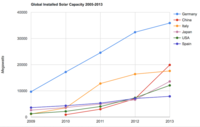 In the USA, even after growing 60% in 2008, 53% in 2009, 71% in 2010, 86% in 2011, 83% in 2012 and 64% in 2013 solar energy capacity only totaled 1% of USA total electrical capacity. In 2013 hydropower was 6.8%, wind was 5.3% and biomass was 1.3%. The increase in solar capacity should continue to grow rapidly and is starting to make significant contributions to the macroeconomic energy picture.
When you look at total electricity generation solar only represented .5% (compared to 6.6% for hydropower 4.1% for wind and 1.5% for biomass). continue reading: Solar Energy Capacity by Country (graph 2009 - 2013) - Adding 50,000 Jobs a Month is the New 150,000 in the USA Due to Demographic Changes
Due to changes in the demographic makeup of the USA we are not adding nearly as many working age people as we have been for several decades (the large number of people reaching retirement age is a big part of this shift). continue reading: Adding 50,000 Jobs a Month is the New 150,000 in the USA Due to Demographic Changes - Default Rates on Loans by Credit Score
About 38% of people have credit scores from 750-850 (<1% default rate). Another 37% from 600-749 (5+% default rate) and about 25% from 350-599 (25+% default rate). continue reading: Default Rates on Loans by Credit Score - Decades Later The USA Health Care System is Still a Deadly Disease for Our Economy
Health care is extremely expensive everywhere. But in the USA the health care system is twice as costly as other rich countries. This is an enormous burden on the USA economy. Nothing else comes close to being as costly in terms of direct spending. And there a a great deal of other damage done that can’t be seen in just the 100% more the USA spends on health care than other rich countries spend. And the health outcomes are no better for the extra hundres of billions of dollars spent every year for health care in the USA.
The costs of decades of failure are extrodinary. continue reading: Decades Later The USA Health Care System is Still a Deadly Disease for Our Economy - Chart of Global Wind Energy Capacity by Country from 2005 to 2015
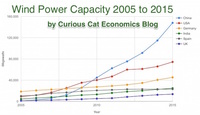 In 2013 global wind energy capacity increased only 13% while in both 2014 and 2015 it increased 17%. Still 17% is less than any year in the last 10, except 2013.
At the end of 2013 China had 29% of global capacity (after being responsible for adding 62% of all the capacity added in 2013). In 2005 China had 2% of global wind energy capacity. At the end of 2015 China accounted for 34% of global capacity, the only country in the top 8 increasing their share of global capacity. The USA now has 17% of capacity. continue reading: Chart of Global Wind Energy Capacity by Country from 2005 to 2015 - 2015 Health Care Price Report – Costs in the USA and Elsewhere
The damage to the USA economy due to inflated health care costs is huge. A significant portion of the excessive costs are due to policies the government enacts (which only make sense if you believe the cash given to politicians by those seeking to retain the excessive costs structure in the USA the last few decades buy the votes of the political parties and the individual politicians).
In 2015, Humira (a drug from Abbvie to treat rheumatoid arthritis that is either the highest grossing drug in the world, or close to it) costs $2,669 on average in the USA; $822 in Switzerland; $1,362 in the United Kingdom. This is the cost of a 28 day supply.
...
The report also includes the cost of medical procedures. For both the drugs and the procedures they include not only average but measures to show how variable the pricing is. As you would expect (if you pay attention to the massive pricing variation in the USA system) the variation in the cost of medical procedures is wide. For an appendectomy in the USA the 25th percentile of cost was $9,322 and for the 95th was $33,250; the average USA cost was $15,930. The average cost in Switzerland was $6,040 and in the United Kingdom was $8,009. continue reading: 2015 Health Care Price Report – Costs in the USA and Elsewhere - USA Health-Care System Ranks 50th out of 55 Countries
None of these rankings are perfect and neither is this one. But it is clear beyond any doubt that the USA healthcare system is extremely costly for no better health results than other rich countries (and even more expensive with again no better results than most poor countries). It is a huge drain on the economy that we continue to allow lobbyists and special interests to take advantage of the rest of us... continue reading: USA Health-Care System Ranks 50th out of 55 Countries - Solar Energy Capacity Continues to Grow Rapidly (Chart of Data by Country)
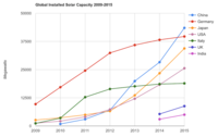 The International Energy Agency (IEA) estimates Italy has the largest percentage of electricity needs capable of being produced by installed PV systems at 8%, with Greece at 7.4% and Germany at 7.1%. Japan is ranked 5th at just under 4%, UK is 12th at 2.5%, China is 22nd at 1%, India 24th and the USA 25th at close to .9%. They estimate the total global percentage at 1.3%.
The global percentage is rapidly increasing each year as solar costs have shrunk and the benefits of reducing climate change causing pollution are known to be extremely important for the future of the planet. continue reading: Solar Energy Capacity Continues to Grow Rapidly (Chart of Data by Country) - Stock Market Capitalization by Country from 2000 to 2016
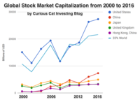 One way to view the dominance of mega-companies is that the market cap for the top 4 stocks exceeds the market cap of all of Canada’s stocks (Apple $807 billion + Alphabet $687 billion + Microsoft $588 billion + Facebook $507 billion = $2.589 trillion). The next, Amazon $477 billion, bring the total for the top 5 to over $3 trillion (and surpasses the UK market cap, leaving only USA, China and Japan as larger markets).
The USA market capitalization was at 46.9% of the global market cap in 2000 and fell to 31.6% in 2000 before rising to 42% in 2016. China grew from 1.8% of world stock market capitalization in 2000 to 6.9% in 2012 and 11.2% in 2016. Adding Hong Kong to China’s totals shows 3.7% in 2000 with growth to to 12.2% in 2012 and 16.2% in 2016.
You may be surprised to learn that 26% of USA equities are owned by investors outside the USA.
continue reading: Stock Market Capitalization by Country from 2000 to 2016 - 30 Year Fixed Mortgage Rates and the Fed Funds Rate
 There is not a significant correlation between moves in federal funds rate and 30 year mortgage rates for those looking to lock in mortgage rates. For example, if 30 year rates are at 6% and the federal reserve drops the federal funds rate 50 basis points that tells you little about what the 30 year rate will do. continue reading: 30 Year Fixed Mortgage Rates and the Fed Funds Rate - Manufacturing and the Economy (2005)
The conventional wisdom was that the rest of the world would not be able to compete with the United States for high wage, high value jobs. It turns out the rest of the world is much more able to compete for that work than was expected.
...
I think we often talk as though manufacturing in the United States is not feasible. Yes, things are changing, and have been for several decades. But the United States is still the largest manufacturer in the world.
It is true (in my belief – and based on the statistics above and in the graphs) that the United States has been decreasing manufacturing employment. And it is also true other countries – notably: China, Korea and Mexico are increasing manufacturing output. However, I believe the there has been no increase (in fact I believe their has been a decrease) in manufacturing jobs worldwide.
[in future posts I was able to find data that showed in fact China, while manufacturing output was booming, actually lost more manufacturing jobs than the USA did: Manufacturing Employment Data: USA, Japan, Germany, UK… 1990-2009, Manufacturing Job Losses: USA 2 million, China 15 million from 1995-2002, Global Manufacturing Employment Data – 1979 to 2007, Manufacturing Jobs Data: USA and China, ] continue reading: Manufacturing and the Economy (2005)
|